Piechart in R
Piechart
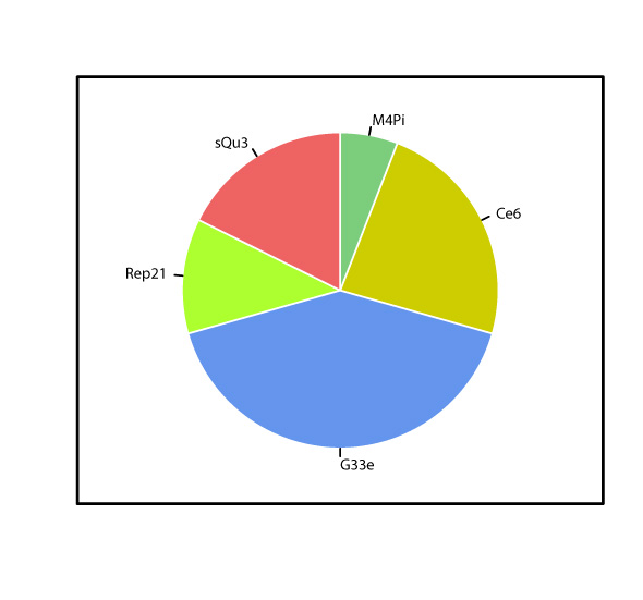
A piechart helps to present frequencies and relationships of frequencies. The pie()-function draws the piechart which starts "at 3 o'clock" by default and continues counter-clockwise. Using the clockwise =-argument this can be changed.
This graphic was created using the following code:
y <- c(1, 4, 7, 2, 3)

par(lwd = 1)

set.seed(92527)

pie(y, col = c("palegreen3", "yellow3", "cornflowerblue", "greenyellow", "indianred2"), clockwise = TRUE, border = "white", lwd = 4,
   labels = c("M4Pi", "Ce6", "G33e", "Rep21", "sQu3"))

box(lwd = 3)
Tags
Pie chart, different colours, transparency, background colour, dependent size, dependent colours, box, x-axis, y-axis, bottom, left, top, right, labels, without ggplot